Craddock Rentals
Helped a small business by designing a user-friendly equipment rental website while balancing user and business needs
Time Period
3 months
Role
UX designer
UX researcher
Team
Methods
Status
Not yet shipped
Summary
Helped a small business streamline user communication with the aim of increasing conversion rates
Context
PROBLEM
Client favours price negotiation, but users
want price visibility
GOAL
Streamline communication to decrease user frustration
Research revealed that the lack of pricing information on product pages was a major pain point for users, resulting in frustration and increased cognitive load. With this in mind, my hypothesis centred around enhancing communication efficiency. This improvement aimed to foster increased user trust in the business.
BUSINESS VALUE
Aiming to increase user conversion for a new business
Research indicates that the presence of pricing information can boost conversion rates by up to 161%. Ensuring that the absence of pricing does not impact user conversion became a critical objective in this project.
SOLUTION
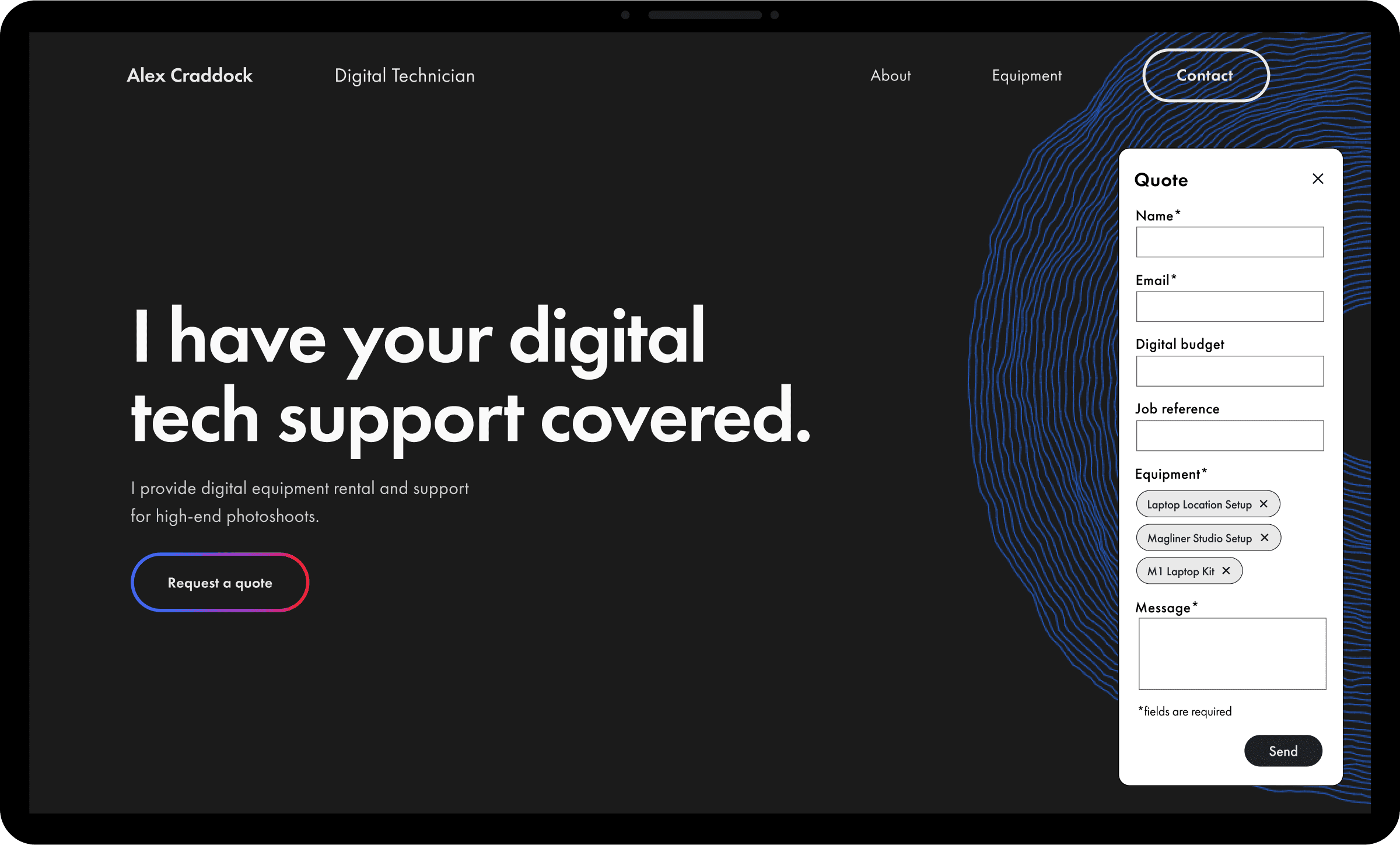
Provide an intuitive quote request form and product information
The solution features a user-friendly equipment rental quote request form, simplifying the process and ensuring an intuitive experience for users. Additionally, we provide comprehensive product information, including specifications and images, empowering users to make informed decisions about their rental choices.
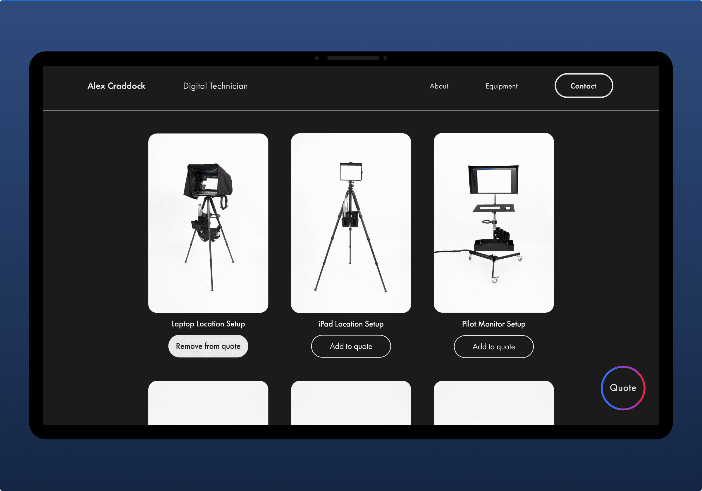
Hover over image to see quote request form
APPROACH
Understanding user needs and business goals
I focused on learning extensively before starting the design process. I conducted thorough research and connected with the client and users to understand the problem better. Then, I developed various design solutions, crafted low-fidelity designs, and conducted testing to ensure their effectiveness before progressing to the development stage.

CLIENT INTERVIEW
Client wanted to showcase equipment without revealing prices to enable negotiation with users
A client interview was conducted to gain insights into the business goals and project constraints, and to inform the development of a website that would effectively drive rental equipment bookings while meeting users' expectations.
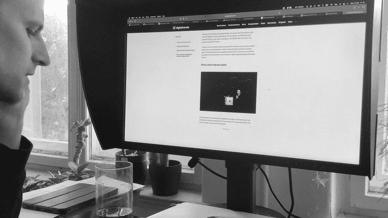
Meeting with the client
Business goals
01
Create an engaging and user-friendly experience that attracts potential customers
02
KPI conversion rate of 2% of visitors into new customers every month
Constraints
01
Limited budget calls for simple and carefully considered design solutions
02
Website needs to launch in three months
03
Client's current customers are not able to provide insights
COMPETITIVE ANALYSIS
Direct competitors miss a user-friendly design for renting equipment
I discovered that the interfaces for hiring equipment among the client's direct competitors are overly complex and not user-friendly, highlighting a significant opportunity for the client's business.
SEMI-STRUCTURED INTERVIEWS
Users main concern is pricing
Due to a constraint of not being able to directly speak to the client's customers, I expanded my search to interview four users from various creative sectors who had rented equipment. After transcribing and theming the data using Dovetail, I identified four prevalent themes.
Trust
01
Reliability and quality are crucial for users, as they depend on the equipment to work flawlessly and be ready for the shoot.
Budget
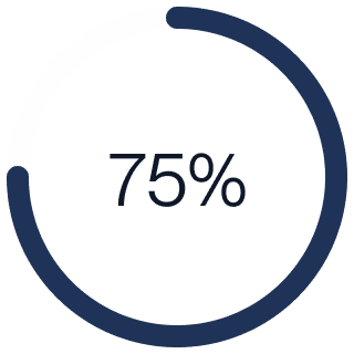
Users are consistently concerned about budget, and lack of pricing information can lead to user frustration in renting equipment.
Fast response
Users' work requires tight deadlines and frequent last-minute changes, necessitating the ability to easily contact personnel at short notice.
Equipment details
04
Users are uncertain about equipment and its use, requiring support and guidance to make informed decisions.

Users are concerned with budget
Users need fast response times

Users do not understand the equipment
LITERATURE REVIEW
81% said that the most important information they want to see on a product page is price
User interviews revealed pricing as a key concern, which prompted me to research industry practices related to pricing strategies and their impact on user behaviour. Providing pricing information on a website can increase conversion rates by up to 161%.
Insights and Solutions
JOBS TO BE DONE
Balancing the user and business needs
Creating a list of Jobs to be Done after conducting research allowed me to better understand the needs and goals of the users and business owner, leading to more effective and targeted solutions for the project.
Client
"I want to streamline the communication and negotiation process with potential customers."
Insight One
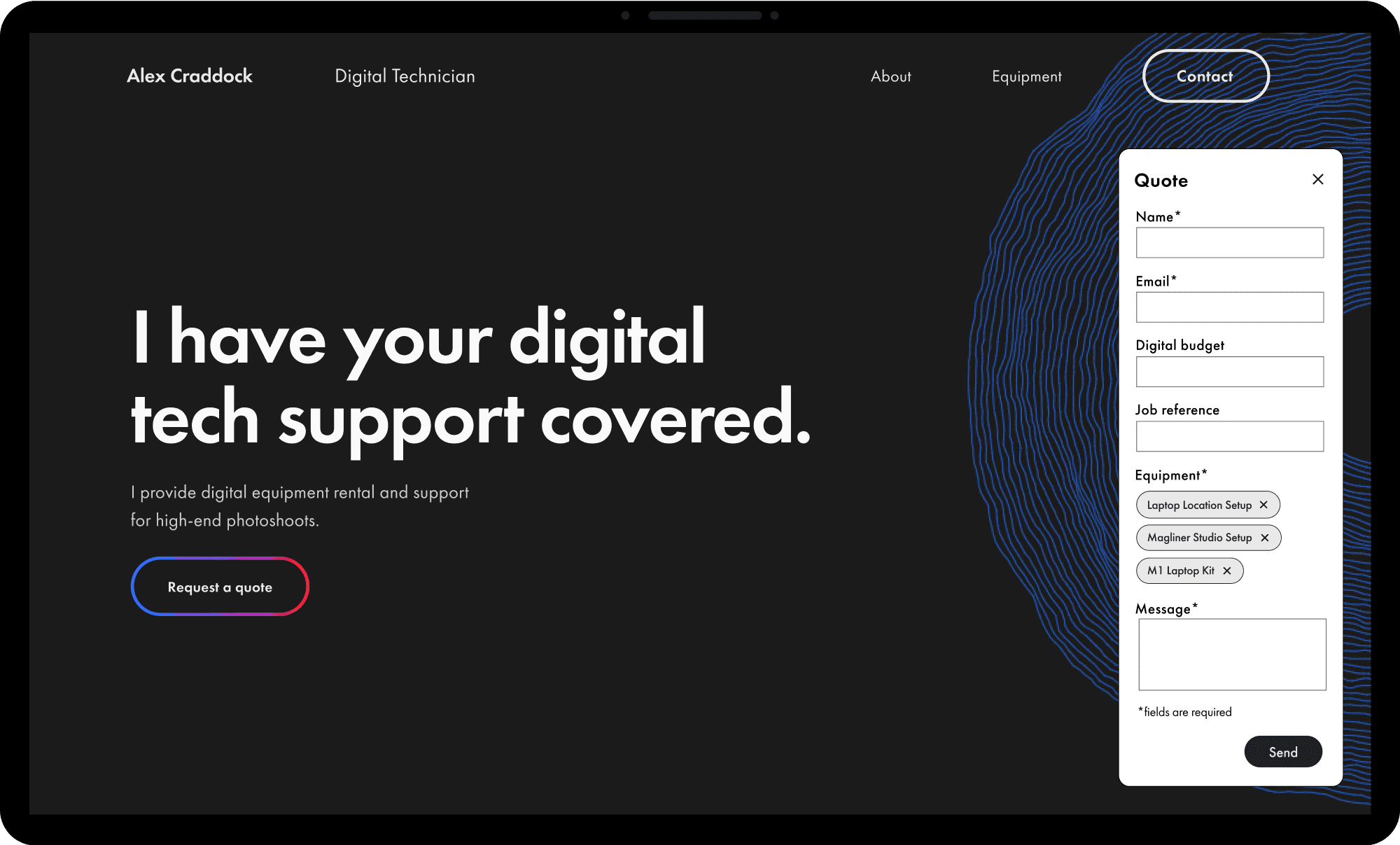
Users prefer transparent pricing for equipment, while client seeks negotiation
Hero with quote request form
SOLUTIONS
01
Provide a quote request form to help speed up the communication process
HYPOTHESIS
01
A quote request form will create an easy way to contact the stakeholder about specific needs, decreasing in user frustration
02
Creates a sense of customization and personalization for the user
03
Reduces cognitive load and decision fatigue, as it allows users to easily specify their needs without manual input
Insight Two
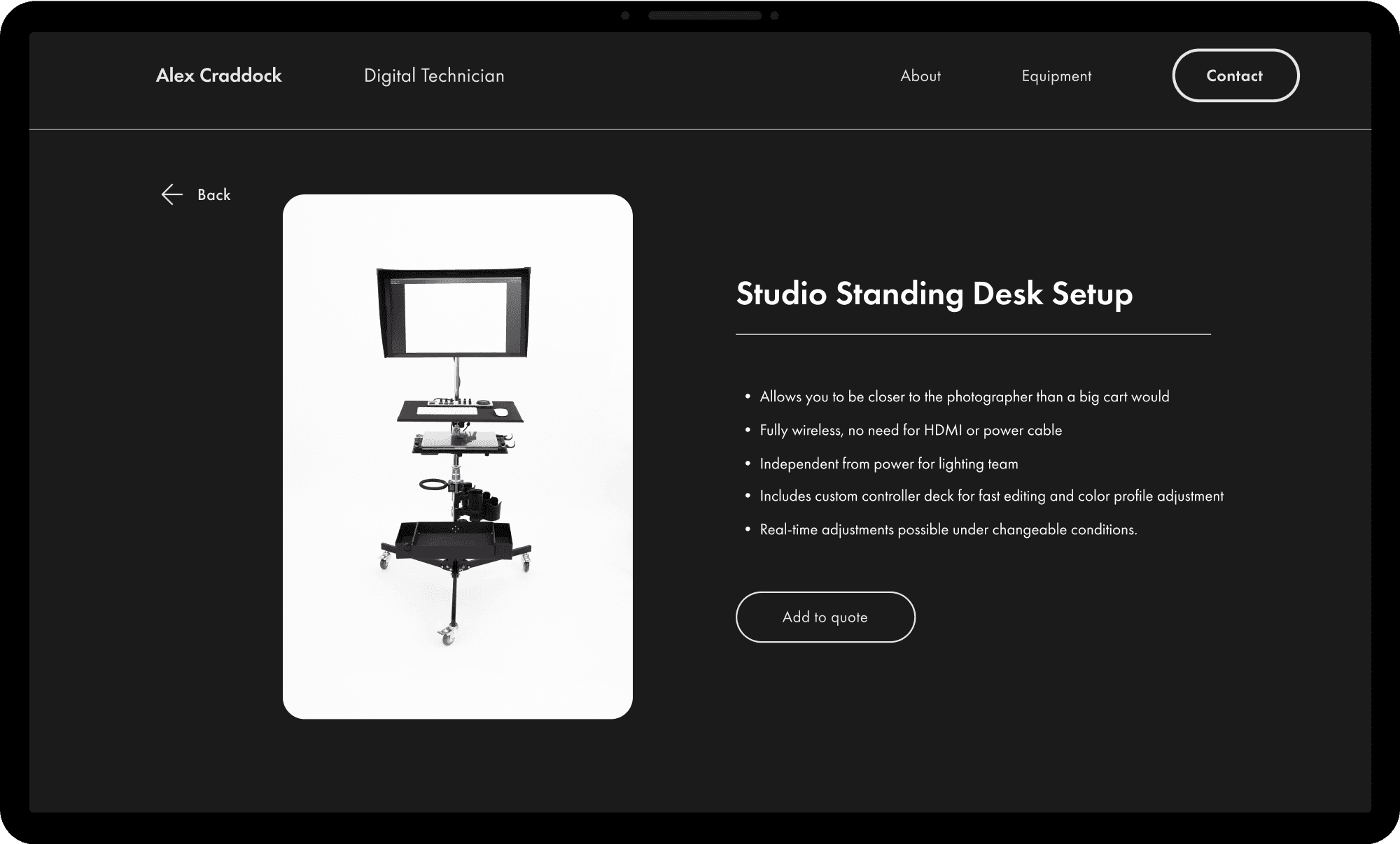
Users need equipment info, while client seeks to prioritise pricing discussions
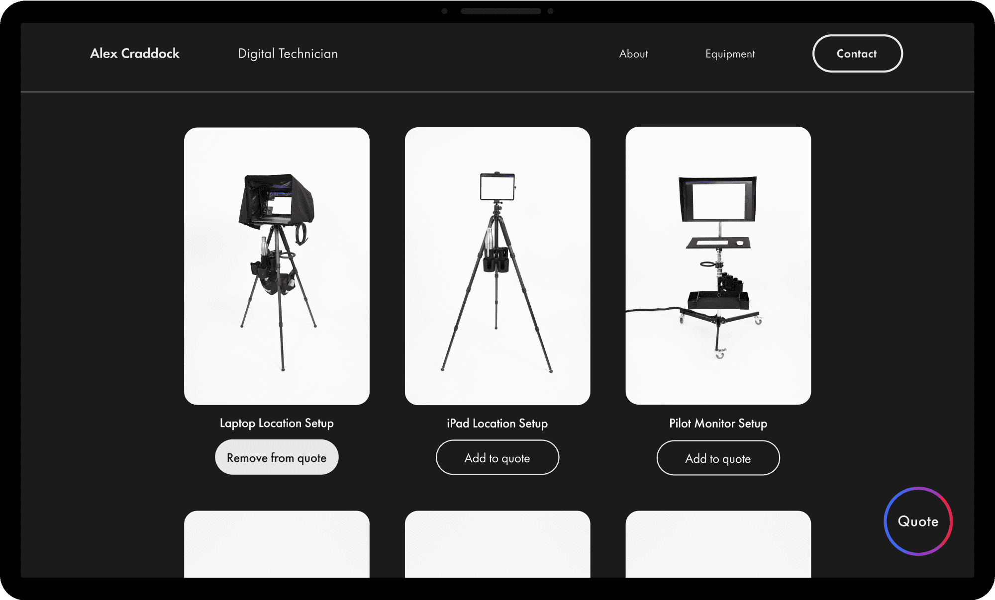
Product page
SOLUTIONS
01
Product pages for the equipment can help users understand the equipment's features and specifications
HYPOTHESIS
01
Will give users a sense of control and reduce cognitive dissonance
02
Creates a sense of transparency, increasing trust in the business
Design
CLOSER LOOK AT A DESIGN SOLUTION
Designing the quote request form
The design of the quote request form aimed to reduce user frustration and cognitive load by incorporating UX principles such as ease of use, simplicity, and clear labelling.
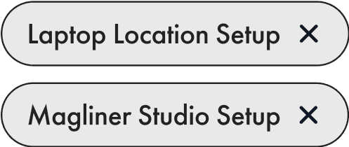
Equipment chips
I used chips to represent the equipment, applying the UX principle of reducing cognitive load and making it easier for users to add or remove equipment without having to type anything.
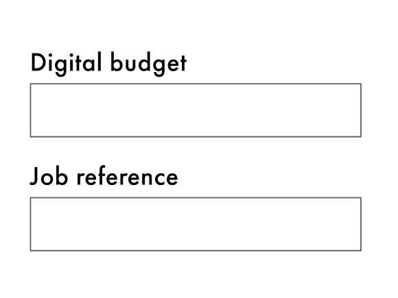
Form fields
The inclusion of budget and job reference fields in the form was intended to gather additional information from the user that could assist in streamlining the communication and negotiation processes.


CTA button
The quote request form appears immediately after the user clicks the call to action button in the hero section. This solution employs UX principles of visibility and feedback.
USER TESTING
Improving the quote form
After creating a low-fidelity wireframe of the form, I conducted guerrilla testing with 2 users.
Users do not always know their budgets
To solve this problem I removed the budget requirement from the quote form. Users have more flexibility to submit requests without being deterred by not knowing their budget, potentially increasing conversion rates.
Users could not see other equipment due to the size of the form
To solve this problem, I redesigned the size of the quote form into one column to decrease user frustration.
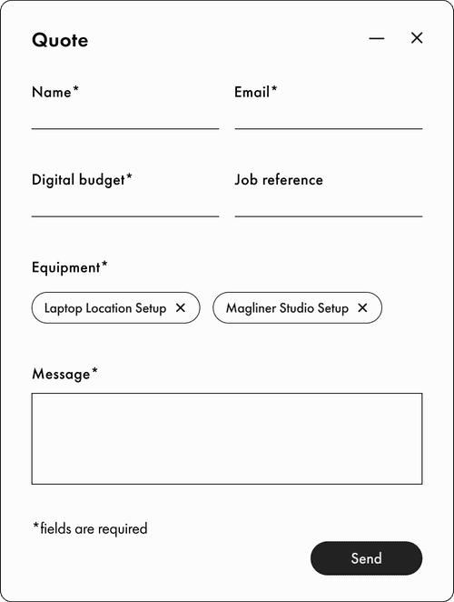
Initial quote form design


Users did not undestand the quote form icon
I changed the symbol for the quote button to something more obvious to avoid confusion and increase the likelihood of user engagement.
Endnote
REFLECTIONS & IMPROVEMENTS
Mobile-first design
I initially designed these solutions for desktop only and then went back and designed the mobile views. Designing the website mobile-first would help to address many of the design issues I encountered during development, as it forces me to focus on the most important and essential elements first, with the tightest constraints.
Designing with constraints
Designing within constraints – specifically, time and budget – helped me move faster in the project and collaborate more effectively with my team by giving us a clear focus and direction.
Product
